
When designing the EMA Radar Report, I was unaware of this video of Gideon Gartner answering a question about the Gartner Magic Quadrant. I only learned of this on twitter last week. Gideon is asked what he would do different if doing the Magic Quadrant today. His answer…he would use spider diagrams. This is exactly what we do in the EMA Radar Report. First published in December 2009, we have published five reports to date with five pending for the first half of 2011 (see the list at the bottom of this post).
We decided to use a spider diagram to measure vendors and their products after doing a project for a client where we used spider diagrams to show multiple metrics simultaneously. We had been looking for a way for EMA to easily display multiple relevant metrics in a product category analysis report, and a spider diagram was the obvious choice.
In past jobs I have been both the product manager for a Magic Quadrant (MQ) reviewed product and researched products to purchase using the MQ in my search. From both perspectives, I always found the analysis to be much more suited to investors or company management than product users. After all, high level categories of “Completeness of Vision” and “Ability to Execute”, speak more to the long term success of the company than to how well suited a particular product is to a specific user’s needs.
In the video, the MQ is described by the audience member asking the question as “…one of the most reviled methods in the industry”. Use any tool incorrectly, and you will probably not like the result. If people do “revile” the MQ, I would suggest it has more to do with its misuse than anything else. CIO’s and other business executives want a simple answer to “what is the best product?”. They force evaluation teams to blindly follow the MQ. Are they investing in this company or looking for a viable solution to their specific needs? No analysis of this type can represent a specific use case. It is a guideline at best. But when it becomes a litmus test for which products are considered, it breeds contempt by the folks who must ultimately use the product as well as generating strange behavior from vendors in their quest to pass the litmus test. This is not healthy for the industry. In Gideon’s words, “…it is overused, misused, and abused…terribly”.
I wanted EMA to provide an analysis that would help evaluation teams in matching their specific needs with the best available products. The EMA Radar Report is focused on things a buyer is interested in when looking at an IT management tool:
- Product Functionality
- Architecture & Integration
- Deployment & Administration Effort
- Cost
- Vendor Strength
These five measurement categories are used to make up the five axes of the Radar Report spider diagram. The vendor’s scores are plotted with the solid blue line and an average of all products’ scores are plotted with the shaded green.
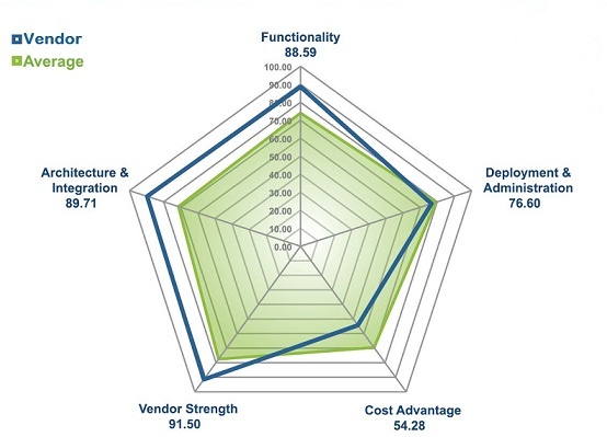
This provides a multi-dimensional view of a given vendor/product. Two axes are dedicated to what you get: (1)features and (2)the underlying architecture and how it integrates in your environment. Two axes are dedicated to what you have to give up: (1)effort to deploy and administer over time and (2)what you pay in licenses and maintenance. The fifth axis measures the vendor strength in terms of vision, financial strength, market presence, etc. The vendor characteristics are not ignored, but do not overpower the outcome either. The average of all products in the analysis provides perspective as to how this vendor/product compares to others. While I initially thought we would stop here with the charting of data, reviews with end users showed that there was a need for an overall market mapping of the vendors.
Seeing all vendors in one chart may very well have its roots in the MQ, which has trained folks to expect this kind of whole market representation. The MQ is really an adaptation of a portfolio analysis tool originally developed by the Boston Consulting Group in the early 1970′s. In the original use of this tool, the portfolio was the group of products or business units in a company. The analysis was to determine which ones to continue to invest in to maintain leadership(Rising Stars), which to invest in or alter for their potential(?’s), which to milk for profits(Cash Cows) and which to dump(Dogs).
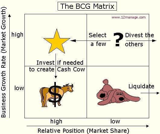
The MQ appears to have been adapted from this tool to look at a portfolio of available products in a category. They changed the measurement criteria from market share and market growth rate to completeness of vision and ability to execute. They also flipped the best box or quadrant from the top left to the top right. It is important to realize that the only bad box in the original analysis of business units was the Dogs. While the high market share in a high growth market (Rising Stars) is the best place to be, a low market share in a high growth market (?’s) represents opportunity and a high market share in a low growth market (Cash Cows) represents an aging but profitable business. You have to look at the characteristics behind the labels on a given box or quadrant as each represents a different way to benefit. It was not designed to be a pure litmus test.
In listening to the end users we talked to about the Radar Report, we decided to incorporate an adaptation of portfolio analysis as a summary point in addition to the spider diagram. We choose a later and more advanced model developed by McKinsey & Co. for GE as a point of departure for the Radar Report.
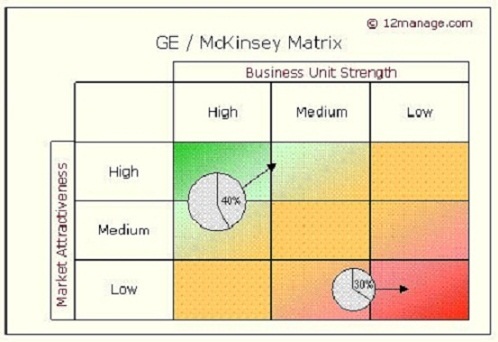
Readers were now so used to thinking upper right was the place to be, that we too flipped the chart from its original design(only after reviewing early drafts with a number of end users). A chart like this really only shows two dimensions. The spider as used in the Radar Report shows 5. The EMA Radar Report incorporates this portfolio view by combining the two legs of the spider diagram that represent what you get (functionality and architecture) as Product Strength on the vertical axis and what you give up to get the product (deployment and administration time and license and maintenance cost) as Cost Efficiency on the horizontal axis. By varying the size of the vendor bubble on the chart, the vendor strength metric is a third, but less important dimension.
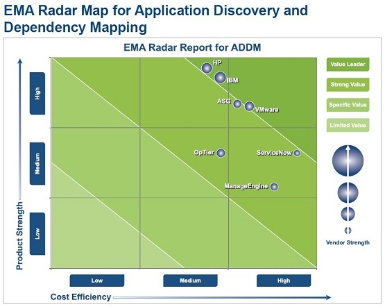
By using this adaptation of portfolio analysis, we provide a summary view of vendors/products in a product category as scored by our analysis. But we also provide a meaningful drill down from this summary by way of the 5 axes in the spider diagram. The point of the chart is not who is most in the upper right of the chart, but what are the characteristics of the available products and which is the best fit for a given organization. A medium Product Strength score on a fast to deploy, easy to operate and relatively inexpensive product may be the best fit. Readers need to understand their needs and resources and pick the best fit for them. A Bugatti may be at the top right of a report on sports cars, but that does not make it the best fit for everyone. Budget, your intended use (daily driving or track driving), and the roads you drive on the most (existing infrastructure) have to be considered as you pick a sports car from this fictional report. Top right may be some idealistic best, but not necessarily best for you.
For more information on EMA Radar Reports see - How To Use The EMA Radar Report
Available EMA Radar Reports include:
Free Summary – EMA Radar for Application Discovery and Dependency Mapping (ADDM): Q4 2010
Free Summary – EMA Radar for Application-Aware Network Performance Management Q3 2010
Free Summary – EMA Radar for Business Service Management: Service Impact Q3 2010
Free Summary – EMA Radar for Workload Automation Q1 2010
Free Summary – EMA Radar for Website Vulnerability Assessment Q4 2009
Coming Soon:
- EMA Radar for Wan Optimization
- EMA Radar for CMDB
- EMA Radar for Software Asset Management
- EMA Radar for Client Lifecycle Management
- EMA Radar for Hosted Message Security


